Body Type is currently being tested within the design community by invitation only. If you would like to test the font and provide feedback, sign up with your email and we will send you an invitation.
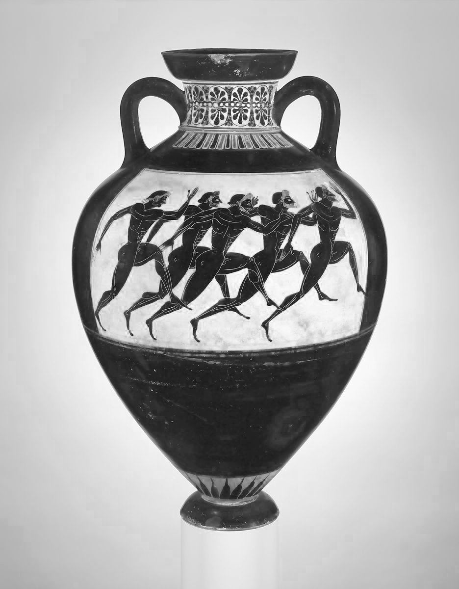
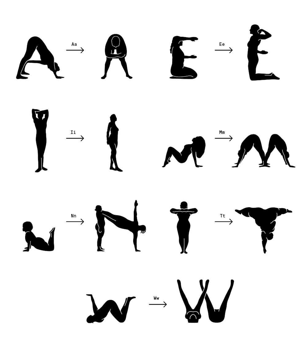
The drawing style of Body Type is inspired by the black-figure pottery painting of ancient Greek vases. This style was developed around the 5th century BC, at a time when the subject of artistic creation shifted from tales of the Gods to daily activity of humans. However, only a certain type of human were depicted in those arts. We find it meaningful to apply this timeless style to all kinds of people today, but with simpler shapes and softer lines and instead of idealized body types we use real bodies as the basis for our letterforms.
In creating this font, we purposefully broke quite a few rules in type design, specifically there is no x height or standard stroke width. There is no uppercase and lowercase distinction, but in some cases we do provide alternatives for some letters to allow for layout flexibility and greater legibility.
Body Type is best used for campaign headlines, slogans, posters and short sentences to deliver great impact - it is probably not the best font for small text or long paragraphs. It is not designed to give a “clean, geometric look”. It is designed to make you stop and think, to peruse the letterforms which in themselves say as much as the words they create. By choosing this font and creating visibility around it we hope that Body Type will increase our acceptance of body diversity, and allow what we say to be more human, both literally and metaphorically.
The complete version of Body Type, including numbers and punctuation, will be released early 2023. Proceeds from future font sales will be donated to support our community partner Scope of Work. Sign up with your email to get notified when Body Type is ready for release.